Effective navigation and search functionality are essential to ecommerce success. When customers can’t find what they’re looking for quickly and easily, they simply leave, seeking out competitor brands that offer an effortless online shopping experience.
According to a Nosto study (June 2025), 69% of shoppers go directly to the search bar when visiting ecommerce sites, but 80% leave due to poor search results, contributing to a 39% bounce rate.
These numbers highlight a real issue that many ecommerce sites are failing to address. With numerous alternatives just a click away, a poorly navigated website doesn’t just cost a sale, it risks losing customers permanently.
So how do you guarantee your navigation works for customers? We turned to our frontend developers, Luis and Andrea, at e2y to share their expertise on the proven navigation strategies that separate successful ecommerce websites from their competitors.
Core Principles
What are some of the foundation practices for good ecommerce site navigation?
The foundation of good ecommerce site navigation is keeping it simple and clear, with easy-to-understand categories, labels and filtering. Common navigation mistakes we see brands make include cluttered navigation menus with too many options that overwhelm customers and hiding important links like customer support or return policies.
Navigation Structure
How should navigation be structured for ecommerce sites with a large catalogue?
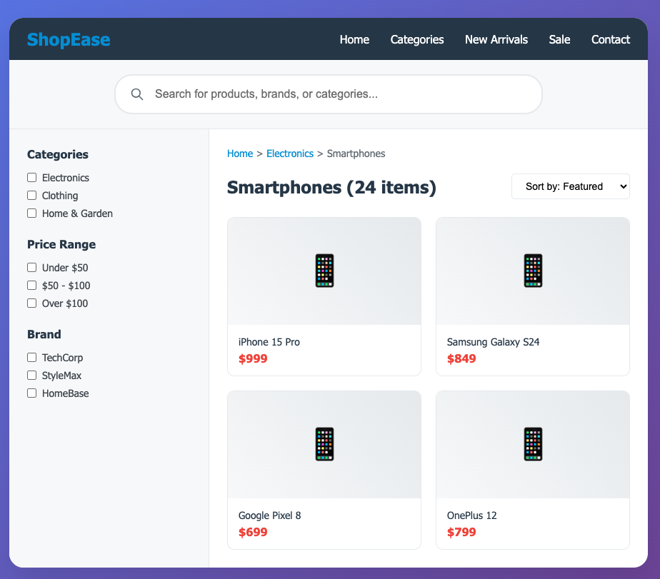
Navigation should be structured in a way that helps customers find products quickly and without getting overwhelmed. This requires both robust search functionality and well-organised navigation, with features like a strong search function, multi-select, dynamic filtering and category-specific facets.
For one project, we developed a B2B marketplace for a client that had an extensive catalogue. We implemented a mega menu that grouped products under the most important top-level categories, making it easier for customers to navigate the catalogue without friction.
On the search and category pages, we used collapsible subcategory filters to organise products. This approach minimised cognitive load by showing only the most relevant information first, while still allowing users to drill down into more specific options when needed. It helped maintain clarity and focus, even as the catalogue expanded.
Mobile Navigation
How do you keep the experience consistent between mobile and desktop?
Establish a clear design system that uses the same colours, fonts, icons, and layout patterns across both devices. While the design may be simplified on mobile, the overall feel, flow, and functionality should remain familiar so users can switch between devices without confusion. Responsive design supports this by ensuring elements can adjust naturally to different screen sizes.
UX and Usability
How do you balance good design with usability?
Using clean layouts, clear fonts, and consistent colours that match the brand but don’t distract from the content. It’s also important to prioritise functionality, like making buttons easy to find and click. Every design choice should support the user’s ability to accomplish their goals quickly and intuitively, without sacrificing the brand’s unique look and feel.
Performance and Scalability
How do you ensure navigation remains scalable as product lines and catalogues grow?
To keep navigation scalable as product lines grow, it’s important to build it with flexibility in mind from the start. This means organising categories and subcategories in a clear hierarchy that can scale smoothly whilst staying organised.
A good example of this is our work for one of our clients, Duni Group. As their product range expanded across different markets, availability and use cases, we implemented a flexible and scalable navigation structure based on the product’s attributes.
Instead of hardcoding categories, we used a combination of multi-level category hierarchies and product attributes, allowing items to appear in multiple relevant sections without duplication. A key feature was the use of dynamic, attribute-driven filters that automatically adjusted based on the available data. This ensured that as new products or entire categories were introduced, the navigation and filtering system updated seamlessly without requiring manual changes.
For more insights on ecommerce and marketplace optimisation, contact our expert team or follow us on LinkedIn.